Learning from the F-pattern
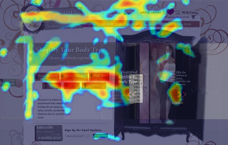
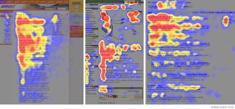
As marketers we use different types of software to try to understand customer behaviors and experiences. One type of software that can be helpful for understanding exactly what visitors do on a website is heat mapping. Heat mapping uses code installed in the website and can see exactly where a visitor’s cursor/mouse goes on the page and where they click. In other studies, eye-tracking software is used to track the movement and focus of users’ eyes on websites. In these studies, the more users that look at a certain part of the page, the more color builds up on visualizations. The red colors display the most focus, then the orange, and yellow. The grey colors show the areas that didn’t get any attention.

When the Neilson Group conducted this study, they found that a trend emerges. People tend to spend up to 69% of their focus on the left side of the page. Users also tended to scan across the top few lines horizontally. When you put the vertical and horizontal together you get an F shaped pattern.
So what does this mean for us?
In simple terms, we should place the most important items, the ones we want people to notice, along these “lines of sight”. We already know that most users “scan” the page rather than read it, and that their attention is fleeting. So put the “meat” right up front where it can grab their attention.
There’s no use in trying to fighting human behavior, so remember the F pattern next time you decide to place something on your website.

Good to know about Heat mapping…..Having a great time reading your blog post. you know what your readers want. Keep posting.